A 2022 survey by the non-partisan Environmental Integrity Project determined that Indiana has the most polluted rivers and streams of any state — dead last in terms of water quality. 50 years after the Clean Water Act, the survey finds that Indiana has the most miles of rivers and streams deemed too polluted to swim, and that almost all of its lakes and reservoirs are unfit for drinking water. This puts undue pressure on the state’s water utilities to remove harmful bacteria like E.coli and toxic algae. The main culprit is manure running off of large animal farms called concentrated animal feeding operations — a type of pollution the Clean Water Act wasn’t designed to handle. These corporate factory livestock farms must be held to higher account, and correct the damage they have done to Indiana’s environment.
This is the catalog for the exhibition of the same name in the galleries at the Herron School of Art + Design. The exhibition filled the school’s three gallery spaces and included artwork by local and internationally known black artists in conversation with historical documents and records from the time of slavery. The exhibition was curated by Jonathan Square, Assistant Professor of Black Visual Culture at Parsons School of Design in New York.
It’s been so much fun to design posters for The Bigger Picture Show. When the big night arrives it’s fascinating to see the redesigned interpretations of classic film posters. Even better – money raised from the sale of posters benefits the Indy Film Fest, which has been a wonderful event for the city.
Zodiac
The Birds
The Girl with the Dragon Tattoo series
The Planet of the Apes series
Midsommar
Psycho
Twelve Angry X-Men
(2019 movie mashup)
Big Trouble in Little Chinatown
(2019 movie mashup)
Species
Lost Highway
Sid and Nancy: Love Kills
Flashdance
Gojira
Julie & Julia
Rosemary's Baby
2001: A Space Odyssey
The Right Stuff
Sunset Boulevard
The Shining
That Thing You Do
Ghost World
Rebecca
The Dark Knight
Almost Famous
Chinatown
In Cold Blood
PAD Architecture is the new Indianapolis firm that evolved from the venerable Demerly Architects. The identity we created for them is built on a simple grid and uses basic curves and lines to assemble a stencil design that is both modern and classic. Applications for the identity include a playful dismantling of the logo shapes into a vibrant pattern, as well as bold use of the core logo on a number of specialty items and corporate communication materials.
Both the offensive and defensive remnants of the Cold War are documented in Countdown, a photo book that showcases the work of artists Jeanine Michna-Bales (Fallout) and Adam Reynolds (No Lone Zone). The starkly eerie imagery is presented in two halves of the book that meet in the center with a special collaborative work that depicts an explosive conclusion to each artist’s building tension. Countdown also contains insert booklets that include an essay by Slate national affairs columnist Fred Kaplan, and an extensive checklist with comments from the artists.
Regarded as the most well known modern furniture designer of his time, Edward Wormley is now barely known among most devotees of mid-century modern design. For over thirty years, Wormley worked closely with Indiana’s Dunbar Furniture Company to produce beautiful and finely crafted designs that drew from the past, but were always suited for the modern lifestyle. The superior quality of his work earned him numerous accolades, including consistent placement in MoMA’s Good Design exhibitions of the 1950s. The fifteenth issue of Commercial Article is Edward J Wormley — Modernism from the Past. All available issues of Commercial Article are available here.
This oversized publication/workbook was designed in collaboration with Studio Lauren Zoll — an Indianapolis-based artist who works within a constantly evolving series of media and techniques. She created the sculpture “Bending Light” as a gift for the people of the underserved Shelton Heights area of the city. It explores concepts of light and light refraction. The workbook offers visitors an opportunity to play with the art and see how patterns, colors, and typography are distorted and affected by looking through the acrylic rods that comprise the sculpture and adjacent “reading rods.”
This ongoing project is a de facto annual report for the Indianapolis chapter of the American Institute of Architects. While the size remains constant, the look evolves and becomes an interpretation of each president’s programming theme for that particular year. One of our favorite projects year after year!
Zesco is an evolving, fifty-year-old, family-run restaurant supply business in downtown Indianapolis. We were asked to create a new graphic identity that represented the four pillars of their operating structure: design, supply, instal, and repair. Our solution suggests a blueprint with stylized stencil type, and a series of icon components depicting many aspects of what Zesco offers to their customers.
It’s been so much fun to design posters for The Bigger Picture Show. When the big night arrives it’s fascinating to see the redesigned interpretations of classic film posters. Even better – money raised from the sale of posters benefits the Indy Film Fest, which has been a wonderful event for the city.
Zodiac
The Birds
The Girl with the Dragon Tattoo series
The Planet of the Apes series
Midsommar
Psycho
Twelve Angry X-Men
(2019 movie mashup)
Big Trouble in Little Chinatown
(2019 movie mashup)
Species
Lost Highway
Sid and Nancy: Love Kills
Flashdance
Gojira
Julie & Julia
Rosemary's Baby
2001: A Space Odyssey
The Right Stuff
Sunset Boulevard
The Shining
That Thing You Do
Ghost World
Rebecca
The Dark Knight
Almost Famous
Chinatown
In Cold Blood
In August of 2022, Indiana Governor Eric Holcomb signed Senate Bill 1 restricting access to abortion at any stage of gestation except in cases of rape, incest, fetal anomalies or when the pregnant person’s life is at risk. This draconian policy marks the state’s commitment to a shockingly regressive regard for the women of Indiana and the autonomy they have had over their own bodies for the last 50 years. It effectively sends Indiana into the past to a pre-Roe world and erases any perception that this is a state that could be regarded as progressive in any sense of the word.
Our work for the Benjamin Harrison Presidential Site helps that organization preserve and celebrate the legacy of America’s 23rd president — the only one from Indiana! We’ve designed invitations for their Mary Tucker Jasper Speaker series, one of which was honored by a first place award from the American Association of Museums. We also designed materials to support their “Old Glory / New Vision” fundraising campaign which will help them share Harrison’s vision for generations to come.
The Columbus Indiana Philharmonic is an organization that not only provides an array of musical performances to the people of Columbus, but also promotes an extensive educational outreach to its schools and community partners. The flexible identity we designed is intended to be both a bold new visual direction, and also a connection to the significant graphic design history Columbus is known for. The identity consists of a series of coordinated marks, colors, and patterns that are intended to create a jubilant expression of the joy of music.
Indianapolis, Indiana may seem an unlikely outpost for the late nineteenth century Arts and Crafts movement. But William Morris’s reach not only extended there, it thrived in many aspects of the midwestern city’s cultural offerings. The uncommon metalwork of Janet Payne Bowles may be best known, but graphic design, architecture, and pottery also took beautiful and unexpected turns there. The effects are still being felt to this day! The fourteenth issue of Commercial Article is Modern Women, Modern Men, Modern Art: The Arts and Crafts Movement in Indianapolis. All issues of Commercial Article are available here!
Huff Homes is the name of the real estate business owned by Indianapolis broker Kelly Huff. Huff specializes in all types of residential real estate with a special emphasis on mid-century modern. The identity we designed for her hinges on bold typography, subtle illustrative details, vibrant patterns, and a hot color palate. And check out that jacket!
The Indianapolis-based American Pianists Association provides the world’s largest fellowships for pianists in both the jazz and classical arenas. Among the notable projects we’ve designed are their updated website and the looks for both the Classical and Jazz Fellowship Awards. The style is clean and simple with strategic use of color to convey the vibrant essence of the music.
Rundell Ernstberger Associates (or simply REA), is a creative firm that for more than 40 years has focused on urban design, planning, and landscape architecture for cities of all sizes across the midwest. Commercial Artisan was commissioned to develop a new identity system that clearly represented the firm’s core ideals, philosophy and standards of quality. We designed a logo using custom letterforms constructed of colorful overlapping components that represent land/flora, water/sky, and the man-made world. The design was extended to numerous collateral materials and a comprehensive brand standards guide.
The North American Textile Conservation Conference (NATCC) is a professional organization charged with presenting and archiving the latest research and advancements in the field of textile conservation. We were asked to redesign their website, which serves as an information hub during their bi-annual conferences, as well as a repository for the presentations that occur there afterward. The site is modern and clearly organized with visual references to the types of textures and materials their visitors would be familiar with.
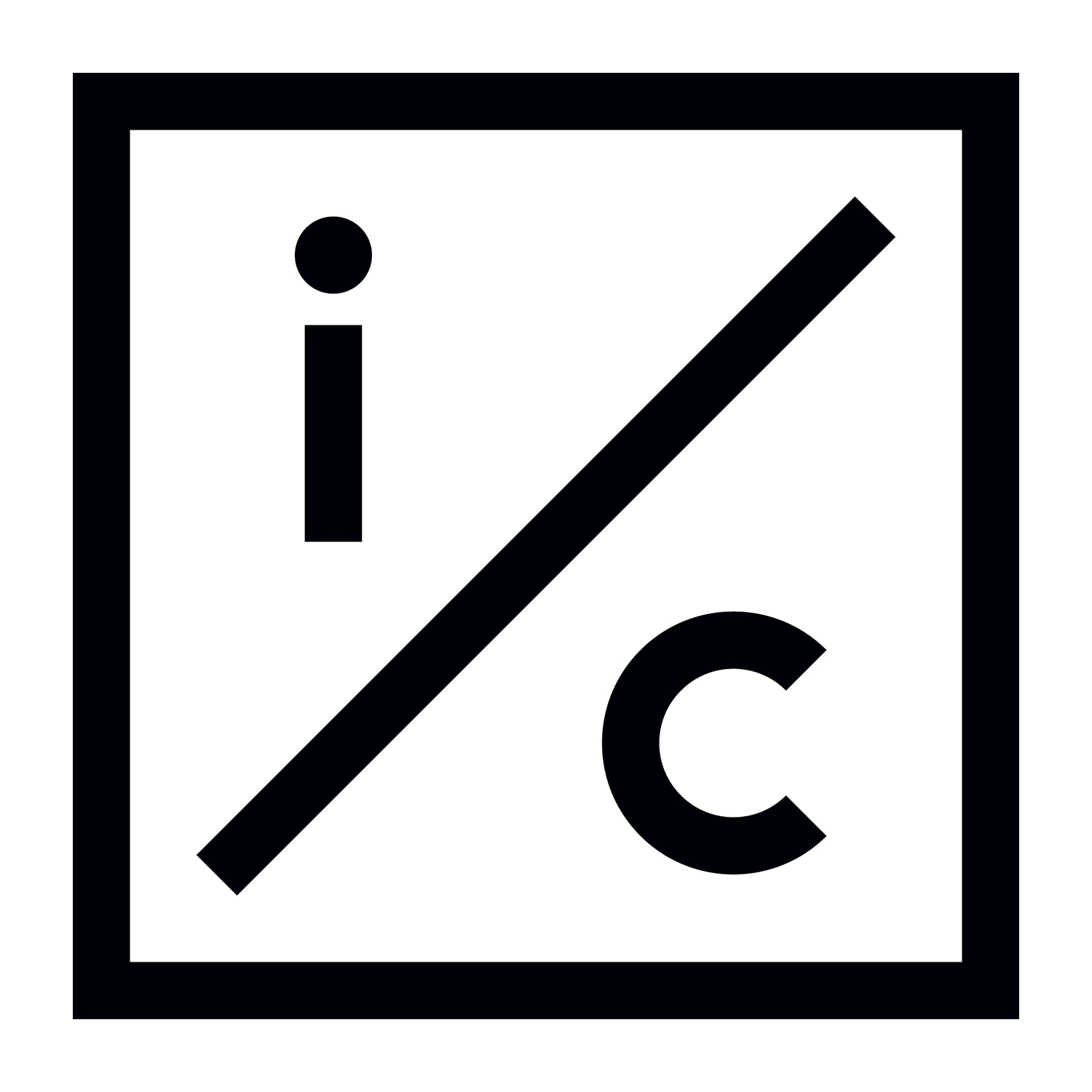
The new graphic identity for Indianapolis Contemporary is a coordinated system of shapes, colors and symbols designed to provide opportunities for creative expression within the organizations’s targeted communications. It is standardized, yet allows for interpretation and variation. Central to the new brand is a simple and confident monogram logo. The letters “i” and “c” are separated by a diagonal slash and encased within a square box that hints at visual references as diverse as traffic signage, insignia and the text-based art of Lawrence Weiner. The identity serves as a bold and playful reflection of Indianapolis Contemporary’s mission to bring thought-provoking and rigorously created art experiences to the people of central Indiana.
This ongoing project is a de facto annual report for the Indianapolis chapter of the American Institute of Architects. While the size remains constant, the look evolves and becomes an interpretation of each president’s programming theme for that particular year. One of our favorite projects year after year!
Holliday Park is one of the great Indianapolis public parks. Located on Indy’s northwest side, the park is home to extensive trails, playgrounds, a nature center, a seasonal music venue, and a sculptural centerpiece called The Ruins. In recent years a public private partnership has spearheaded impressive improvements that have elevated the neighborhood and the park visitor experience. A seasonal ice skating facility is a planned addition in 2022. Our extensive design work for the park includes everything from fundraising materials to logos and t-shirts.
We rarely design self-promotional materials, but always produce a holiday card. Sometimes they take the form of festive garlands and sometimes they’re more traditional, but they’re almost always silly. We love bribing our friends with pizza so they’ll help with the frantic mid-December assembly sessions! Here are a few of our favorites.
Jan Ruhtenberg was an early Modernist architect who was associated with Mies van der Rohe, Philip Johnson, the Museum of Modern Art, and Herman Miller. He was the first European Modernist to come to the United States to teach architecture at a major American University, but is virtually unknown to anyone outside of his family. He had a productive decades-long career in the American southwest, until a supposed scandal brought it all to an end. The thirteenth issue of Commercial Article is Jan Ruhtenberg / Lost and Found. All issues of Commercial Article are available here!
Logos are among the most challenging graphic design projects. There are big expectations for those little marks!
This is an assortment of some of our favorites.
PAD Architecture
Putnam Parks & Pathways
Huff Homes
Indianapolis Contemporary
Zesco Foodservice
Aurora Photo Center
Laura Musall Homes
Columbus Indiana Philharmonic
Rundell Ersntberger Associates
Choreo
Indiana Artisan Seal of Quality
Kari Singleton Interiors
Business Furniture
Tobias House
Basile Opera Center
Building Tomorrow Education Initiative
Indianapolis Civic Theatre
Kurt Vonnegut Memorial Library
ESL Spectrum Lighting
Franklin College President’s Circle
Landstory Landscape Architects
Sports Innovation Institute
Global Institute for Tibetan Medicine
The StressLess Method
Partners In Housing
Mojo Bicycle Company
Event & Tourism Institute
For the past six years, we’ve been fortunate to work for Under Armour, one of the world’s leading manufacturers of cutting-edge apparel and footwear. For 2019 and 2020 we were asked to design two publications to introduce buyers to their updated HOVR line of running footwear. Both the HOVR Tech Book and the RUN Work Book are tools used to educate regular consumers and hardcore athletes alike.
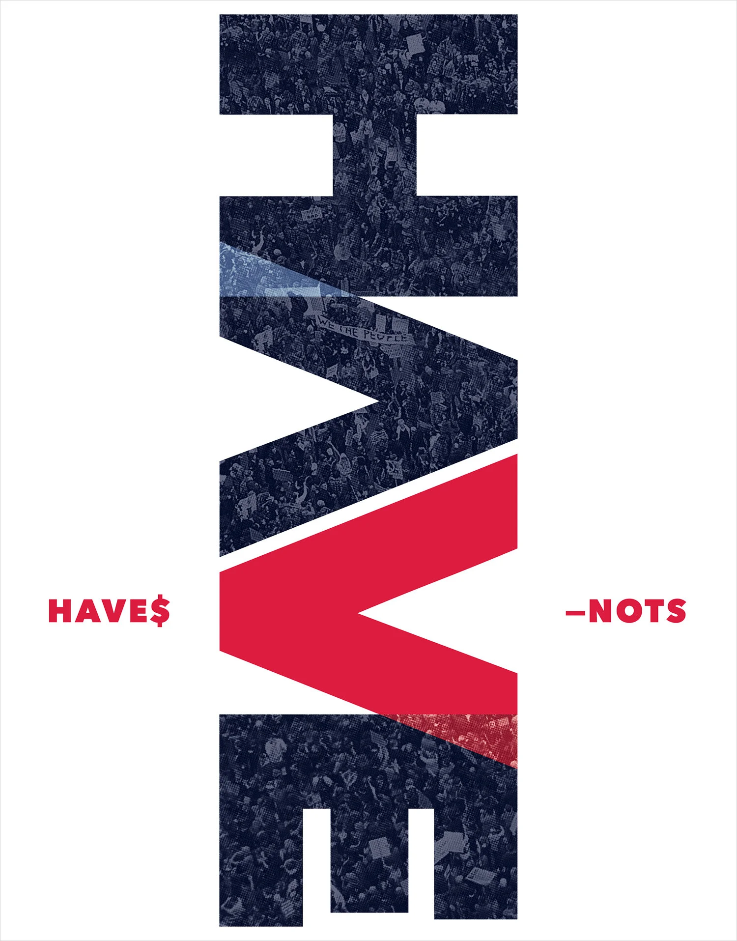
Economic inequality is the topic of this poster we designed for the 2021exhibition “The Sum of Unity”. The invitational exhibition, featuring protest posters by over 50 artists and designers, was curated by Indianapolis-based artist Samuel Levi Jones and was held in the galleries of the Herron School of Art + Design.
Following the merger of IUPUI’s School of Physical Education and Tourism Management and School of Health and Rehabilitation Sciences, we were asked to design a viewbook and proposal folder that highlighted the programs of the new School of Health & Human Sciences. Working within IUPUI’s brand guidelines, we employed textured photography, soft touch paper stocks, and high gloss varnishes to create an information-rich piece that will be used to attract new students for years to come.
Luna Music is the best record store in the solar system. We’ve had the opportunity to design posters, record labels, coffee mugs, t-shirts and even frisbees for our good buddies at Luna. A sticker we designed for Luna even ended up on Joey and Chandler’s refrigerator on the show Friends! Music is an essential component of our day, and we’re very lucky to have such a phenomenal resource just a few blocks away!
Putnam County, Indiana is about an hour west of Indianapolis and home to DePauw University. And as this comprehensive guide shows, Putnam County offers a wealth of cultural, natural, and culinary attractions for visitors to enjoy. Building on the bureau’s existing identity, this guide serves as both an introduction and eye-opening overview to one of Indiana’s emerging treasures.
The Carmel City Center is an upscale, mixed-use, shopping, dining, and living development in the middle of Carmel, Indiana — just north of Indianapolis. The center features an assortment of shopping possibilities, a variety of dining options, residential opportunities, and a new boutique hotel — all adjacent to a spectacular performing arts center. Over the years we have been asked to design a range of projects from collateral brochures and advertisements, to the center’s expansive website.
Cummins is a Fortune 500 company with a storied history of innovation in engine design and functionality. In celebration of their centennial anniversary we were asked to design a series of commemorative t-shirts that celebrated particular moments in their history.
Kenneth Tyler is a treasured alumni of the Herron School of Art + Design, as well as being an internationally regarded printmaker for the world’s most acclaimed artists. We were asked to design a catalog to commemorate a collaborative exhibit between the school and the National Gallery of Australia.
The Indiana Design center is a one-stop shop to redecorate, remodel or build your home. More than 15 showrooms provide access to residential and commercial design products from national brands and Indiana companies. We’ve designed sophisticated looks used in ad campaigns, on-site signage, event invitations and editorial features over the past several years. Their signature LUXE event is a highlight for design enthusiasts every year.
Stupid, Inc. was a novelty stationery company founded by three art school buddies from Indianapolis in 1959. Incorporating wit and imagery in the style of Mad magazine, Stupid, Inc. was a sensation throughout the United States and United Kingdom, until it wasn’t. Their product line included Laff-Lite matchbooks, Bullshit Repellent spray, and Psycho Pads stationery among many others. The twelfth issue of Commercial Article is Stupid Does As Stupid Is. All issues of Commercial Article are available here!
The INDPLS GUIDE (or Indianapolis Guide) is the product of our collaboration with the remarkable periodical shop/salon PRINTtEXT. The guide is a collection of the shop owners’ personalized recommendations of what to do when visiting Indianapolis. It includes contributions from WNBA superstar Tamika Catchings, literary sensation John Green and other luminaries. Our design is a contrast of strong, systematic typography and whimsical, icon-style illustrations provided by the wonderful Manuja Waldia.
Logos are among the most challenging graphic design projects. There are big expectations for those little marks!
This is an assortment of some of our favorites.
PAD Architecture
Putnam Parks & Pathways
Huff Homes
Indianapolis Contemporary
Zesco Foodservice
Aurora Photo Center
Laura Musall Homes
Columbus Indiana Philharmonic
Rundell Ersntberger Associates
Choreo
Indiana Artisan Seal of Quality
Kari Singleton Interiors
Business Furniture
Tobias House
Basile Opera Center
Building Tomorrow Education Initiative
Indianapolis Civic Theatre
Kurt Vonnegut Memorial Library
ESL Spectrum Lighting
Franklin College President’s Circle
Landstory Landscape Architects
Sports Innovation Institute
Global Institute for Tibetan Medicine
The StressLess Method
Partners In Housing
Mojo Bicycle Company
Event & Tourism Institute
Business Furniture is a nearly 100 year-old company that sells exactly what its name describes. Based in Indianapolis and Dayton, Business Furniture is a partner to furniture giant Steelcase and other progressive brands. We were hired to update their logo, but retain their iconic chair symbol. We redrew the chair and paired it with a bold new typographic treatment. Brand guidelines and applications that ranged from notebooks to delivery vehicles followed.
For over 100 years, Indiana’s own Cummins has been a leader and innovator in engine technology. During that time they have also been associated with the Indianapolis Motor Speedway through both the sponsorship and technology of cars racing in the Indianapolis 500. We were asked to design “Hero Cards” that commemorate these Cummins-powered drivers and vehicles as souvenirs for racing enthusiasts visiting the track this year.
As graduates of Herron School of Art + Design, we were particularly honored to be asked to design the school’s viewbook. This piece is a prospective student’s introduction to the school, university and city — and a key part of Herron’s recruitment toolkit. Working with photos from Esther Boston Photography and others, we created a simple design that uses bold typography and tactile production techniques to attract students to all Herron has to offer.
The mission of Kids Dance Outreach is to positively impact the lives of all children through joyful dance programs that inspire excellence, instill confidence, encourage teamwork, and applaud persistence. We were asked to design a strategic report that provides guidance and recommendations for the organization as it grows and moves forward.
AXIS Architecture + Interiors is one of the most progressive and respected design firms in the midwest. Their projects have been honored by the American Institute of Architects with numerous awards.
Our work with them includes developing a look and system of proposal materials they can adapt and assemble on an as needed basis. We’ve also designed a series of booklets that highlight their civic and commercial projects, as well as a refresh of their well-established corporate identity.
Landstory is the name of an Indianapolis landscape architecture firm that uses native landscape characteristics to tell a project’s story. We were hired to redesign their graphic identity, communications pieces, and website. Our starting point was a page-turner of a logo that acts as a visual metaphor for their philosophy. We were very pleased to once again work with Pica Studio on the design and implementation of their site.
Xenia Miller collaborated with modernist giants Eero Saarinen and Alexander Girard on not one, but two homes — Columbus, Indiana’s Miller House being one of the most important residential projects in architectural history. But that’s just the beginning.
Her contributions to architecture, design, art and historic preservation in central Indiana are largely unknown. Along with her husband, Xenia Miller brought art by international figures like Jean Tinguely, and Henry Moore to small town Indiana. She worked with major architectural figures like Edward Larrabee Barnes (and his wife) to bring inspiring design to schools, churches and other civic buildings. She looked to design’s future, but worked to preserve the past. Hers may be one of the great unsung voices in modernism.
More than 84 pages, this issue is illustrated with dozens of full color photos and drawings — many never before published. Offset printed in Indiana on heavy weight uncoated stock.
Written by Connie Zeigler
All issues of Commercial Article are available here!
Luna Music is the best record store in the solar system. We’ve had the opportunity to design posters, record labels, coffee mugs, t-shirts and even frisbees for our good buddies at Luna. A sticker we designed for Luna even ended up on Joey and Chandler’s refrigerator on the show Friends! Music is an essential component of our day, and we’re very lucky to have such a phenomenal resource just a few blocks away!
This ongoing project is a de facto annual report for the Indianapolis chapter of the American Institute of Architects. While the size remains constant, the look evolves and becomes an interpretation of each president’s programming theme for that particular year. One of our favorite projects year after year!
So many events are promoted electronically that when we’re asked to design a real, printed invitation we try to take full advantage of the physicality and make it something memorable. Here’s an assortment of our favorites.
First Merchants Bank was opening a new branch that featured progressive architecture, a coffee bar, a community conference space and other amenities not necessarily associated with a bank environment. We were hired by Skeleton Crew Marketing to work with Greg Whitaker Photography and develop a series of word + picture combinations. These images would not only reflect the quirky nature of the new bank’s neighborhood, but also act as unexpected art statements on screens within the bank.
Logos are among the most challenging graphic design projects. There are big expectations for those little marks!
This is an assortment of some of our favorites.
PAD Architecture
Putnam Parks & Pathways
Huff Homes
Indianapolis Contemporary
Zesco Foodservice
Aurora Photo Center
Laura Musall Homes
Columbus Indiana Philharmonic
Rundell Ersntberger Associates
Choreo
Indiana Artisan Seal of Quality
Kari Singleton Interiors
Business Furniture
Tobias House
Basile Opera Center
Building Tomorrow Education Initiative
Indianapolis Civic Theatre
Kurt Vonnegut Memorial Library
ESL Spectrum Lighting
Franklin College President’s Circle
Landstory Landscape Architects
Sports Innovation Institute
Global Institute for Tibetan Medicine
The StressLess Method
Partners In Housing
Mojo Bicycle Company
Event & Tourism Institute
Choreo is a company that is focused on the future. They strategically assist businesses in adjusting their working environments to be more productive as technologies, business philosophies and design standards evolve. We were asked to refresh their logo and make it more dynamic without sacrificing the recognition already associated with their brand. We then developed a toolkit of brand guidelines and a suite of communications materials that solidified the updated identity.
Early Learning Indiana is a century-old organization that provides leadership, advocacy, and early childhood education services to continually improve the early learning landscape in Indiana. They asked us to design a brochure that serves as both an introduction to the organization and a tool for their development efforts.
We’ve worked with Planned Parenthood of Indiana and Kentucky for several years. We were recently asked to redesign their Access newsletter and annual report to reflect the graphic standards of the national organization. We chose a new compact size and put an emphasis on strong, prominent photography. We also designed their holiday card which does double-duty as a seasonal greeting and a very important piece of fund raising communication.
As part of their centennial celebrations, the AIGA asked representatives from each or its regional chapters to design a chair for the Facing Forward exhibition in New York City. Our design draws inspiration from our Commercial Article project and pays homage to our Indiana graphic design hero Gene Lacy.
So many events are promoted electronically that when we’re asked to design a real, printed invitation we try to take full advantage of the physicality and make it something memorable. Here’s an assortment of our favorites.
For the past six years, we’ve been fortunate to work for Under Armour, one of the world’s leading manufacturers of cutting-edge apparel and footwear. For 2019 and 2020 we were asked to design two publications to introduce buyers to their updated HOVR line of running footwear. Both the HOVR Tech Book and the RUN Work Book are tools used to educate regular consumers and hardcore athletes alike.
Created with the Central Indiana Community Foundation (CICF), these reports are designed to appeal to donors willing to invest in programs supporting three strategically-focussed initiatives: Inspiring Places, Family Success and College Readiness. The goal of the initiative is to develop less fortunate citizenry into contributing members of the community, attract the best and brightest to live here, and retain creative, community-minded and highly educated workforce. Our design is simple and straightforward — using lush photography and emphasizing numerous CICF success stories.
Westfield, Indiana is a city twenty minutes north of Indianapolis, whose growth in recent years has been startling. Investing in world class sports facilities and progressive amenities has propelled this once sleepy farming community into the spotlight. Our work for them includes a brand guide that unites all of the city’s various identity components into one comprehensive document. We have also designed a number of event logos for the parks department as well as a Year In Review publication that summarizes the activities of all city departments.
A designer designing their own visual identity can be a daunting task. We designed this look to represent Commercial Artisan in 2013. Our goal was to abbreviate our company name to as few letters as possible. When we reached CA (and were still dissatisfied) we decided for forgo letters altogether and simply represent ourselves as two dots.
In August of 2013, our retrospective exhibit ink / paper / staples / glue opened at the Herron School of Art and Design and included a selection of work from the previous twenty years. It has since traveled to other locations including the Ajngel Gallery in Croatia.
AXIS Architecture + Interiors is one of the most progressive and respected design firms in the midwest. Their projects have been honored by the American Institute of Architects with numerous awards.
Our work with them includes developing a look and system of proposal materials they can adapt and assemble on an as needed basis. We’ve also designed a series of booklets that highlight their civic and commercial projects, as well as a refresh of their well-established corporate identity.
Logos are among the most challenging graphic design projects. There are big expectations for those little marks!
This is an assortment of some of our favorites.
PAD Architecture
Putnam Parks & Pathways
Huff Homes
Indianapolis Contemporary
Zesco Foodservice
Aurora Photo Center
Laura Musall Homes
Columbus Indiana Philharmonic
Rundell Ersntberger Associates
Choreo
Indiana Artisan Seal of Quality
Kari Singleton Interiors
Business Furniture
Tobias House
Basile Opera Center
Building Tomorrow Education Initiative
Indianapolis Civic Theatre
Kurt Vonnegut Memorial Library
ESL Spectrum Lighting
Franklin College President’s Circle
Landstory Landscape Architects
Sports Innovation Institute
Global Institute for Tibetan Medicine
The StressLess Method
Partners In Housing
Mojo Bicycle Company
Event & Tourism Institute
Originally entitled Haiku, Discovering Japanese Bamboo Art is a 2016 exhibit of unbelievable craftsmanship and creativity at Herron School of Art & Design. Consisting of one collector’s assortment of bamboo sculpture, the show reveal secret upon secret the longer one views them. The catalog we designed is a minimal document of a substantial and thoughtful exhibition.
Fortune Cookies was the title of our 2005 exhibit — a collection of prints that were all based on the prophetic insights of actual fortune cookie fortunes. The results were haunting, deadpan and humorous pieces that featured found as well as self-generated imagery and text.
A designer designing their own visual identity can be a daunting task. We designed this look to represent Commercial Artisan in 2013. Our goal was to abbreviate our company name to as few letters as possible. When we reached CA (and were still dissatisfied) we decided for forgo letters altogether and simply represent ourselves as two dots.
In August of 2013, our retrospective exhibit ink / paper / staples / glue opened at the Herron School of Art and Design and included a selection of work from the previous twenty years. It has since traveled to other locations including the Ajngel Gallery in Croatia.
This ongoing project is a de facto annual report for the Indianapolis chapter of the American Institute of Architects. While the size remains constant, the look evolves and becomes an interpretation of each president’s programming theme for that particular year. One of our favorite projects year after year!
Is the sun rising or setting over the state of Indiana? Which Fortune 500 company’s logo is best described as half-essed? What’s really going on with Burger Chef and Jeff?
In this special tenth issue, we examine Indiana’s graphic identity by researching the histories of its most prominent symbols. Our panel of esteemed writers look at stories behind the logos of Indiana companies like Eli Lilly, the Indianapolis Motor Speedway, Vera Bradley, Cummins, Burger Chef, the Indianapolis Museum of Art, and Ball Corporation. They explore other notable design icons like the Indianapolis and Indiana flags, the Indiana state seal and Robert Indiana’s logo for the city of Columbus.
How do these corporate and civic symbols contribute to the visual and emblematic make-up of the state? We invite you to find out for yourself.
All issues of Commercial Article are available here!
CJ Pyle is an Indianapolis-based artist whose fascinating work straddles the line between beautiful and grotesque. His intricate drawings of faces — seemingly made of fiber and eyes — are completely mesmerizing. We were thrilled to design this site that showcases his work.
Sean Derry is an artist currently based in Pittsburgh, Pennsylvania.
His work addresses contemporary concerns through sometimes simple or common means. Sean has included us as collaborators on the documentation of some of his projects, which are always as thoughtful as they are thought-provoking. As with all work we do with artists, our goal is to extend their vision by accurately interpreting their message and aesthetic.
We’ve designed scores of projects for Brebeuf Jesuit Preparatory School — logos, viewbooks and annual reports just scratch the surface. We implemented a series of standards that created an identity that was modern, but rooted in Jesuit tradition. The school’s emphasis on social justice throughout the world makes Brebeuf one of premier secondary learning institutions in the midwest.
We have a long history with the Indianapolis Museum of Art!
Going back more than twenty years, our projects with the IMA have included guides for educational programs and summer camps, fund raising materials for the Second Century Society, and invitations to gala openings like Dream Cars. But perhaps most significantly are the book projects. We’ve been thrilled to design a half dozen major volumes for exhibits as diverse as Turner In Indianapolis and Crossroads of American Sculpture. The history of the Indianapolis Museum of Art is the subject of Every Way Possible (2008), the most recent in the series.
Luna Music is the best record store in the solar system. We’ve had the opportunity to design posters, record labels, coffee mugs, t-shirts and even frisbees for our good buddies at Luna. A sticker we designed for Luna even ended up on Joey and Chandler’s refrigerator on the show Friends! Music is an essential component of our day, and we’re very lucky to have such a phenomenal resource just a few blocks away!
The Booth Tarkington Civic Theatre celebrated a remarkable 100 year anniversary in 2015. We were asked to document their storied history through the design of Imagination, Education and Participation — a three part display of photos, clippings, interviews and memorabilia. We worked with archivists and the marketing department to produce three towers that divide the story into book-like sections. The display will visit Civic’s current and former locations in the Indianapolis area throughout the year.
Long a mainstay of the Indianapolis art community, James Wille Faust is known for his bold color studies and optical and spacial illusions. Color Meditations is the title of his 2016 show at the Indianapolis Museum of Contemporary Art. Working with the artist and his wife Martha, we designed a catalog in three parts (outer title sleeve, accordion fold booklet, folded poster) to commemorate the show.
Logos are among the most challenging graphic design projects. There are big expectations for those little marks!
This is an assortment of some of our favorites.
PAD Architecture
Putnam Parks & Pathways
Huff Homes
Indianapolis Contemporary
Zesco Foodservice
Aurora Photo Center
Laura Musall Homes
Columbus Indiana Philharmonic
Rundell Ersntberger Associates
Choreo
Indiana Artisan Seal of Quality
Kari Singleton Interiors
Business Furniture
Tobias House
Basile Opera Center
Building Tomorrow Education Initiative
Indianapolis Civic Theatre
Kurt Vonnegut Memorial Library
ESL Spectrum Lighting
Franklin College President’s Circle
Landstory Landscape Architects
Sports Innovation Institute
Global Institute for Tibetan Medicine
The StressLess Method
Partners In Housing
Mojo Bicycle Company
Event & Tourism Institute
In only a few short years, Pattern Magazine has seeming done the impossible by putting Indianapolis on the fashion map! We’ve contributed the design of three feature articles over the course of the past several issues. They feature the photography of Gabrielle Cheikh, Hadley Fruits and Polina Osherov.
People for Urban Progress (PUP) is an Indianapolis-based not for profit that promotes environmental responsibility by rescuing discarded materials and redesigning them for public benefit. We worked with consultants Tamara Zahn and John Beeler to translate their recommendations for PUP’s future into a simple and modern report. The design is meant to be restrained, but also impactful and directed.
We have a long history with the Indianapolis Museum of Art!
Going back more than twenty years, our projects with the IMA have included guides for educational programs and summer camps, fund raising materials for the Second Century Society, and invitations to gala openings like Dream Cars. But perhaps most significantly are the book projects. We’ve been thrilled to design a half dozen major volumes for exhibits as diverse as Turner In Indianapolis and Crossroads of American Sculpture. The history of the Indianapolis Museum of Art is the subject of Every Way Possible (2008), the most recent in the series.
In an admirable effort to bring art to the general public, The Arts Council of Indianapolis developed a series of public art exhibitions in downtown Indianapolis. Art by internationally known artists like Julian Opie, Chakaia Booker and George Rickey was positioned throughout the Indianapolis downtown area. These publications served as exhibit guides and maps to people interested in visiting the art. Our goal was to present the required information in a helpful manner and adapt the design of each guide to reflect the visual sensibility of each artist.
Roland Hobart came to Shelbyville, Indiana from his native Innsbruk in 1966. Known for his bold, graphic precision, he quickly became a highly regarded figure in the central Indiana art community. His literal towering achievement — a downtown Indianapolis super-graphic — is sadly fading and flaking into history. Not content with being famous in Shelbyville, Hobart reinvented himself again! The ninth issue of Commercial Article is Our Own Roland Hobart. All issues of Commercial Article are available here!
This book for Los Angeles artist Tim Hawkinson was designed to reflect his sense of quirky ingenuity. A singer-sewn binding and metallic silver tints throughout help to emphasize the effect. Produced on the occasion of his first major museum exhibition (Contemporary Arts Center, Cincinnati), the book quickly sold out and was honored by the American Center for Design and the Ohio Museums Association.
This book is a tool to help the four legged residents of the Humane Society of Indianapolis. IndyHumane has recently undergone a transformation that positions them as the leading voice for the welfare of animals in Indianapolis. Ambitious new plans will require a great deal of money. The case statement, entitled Once. And for all., is designed to appeal to those most likely to help make the plans a reality. We were thrilled for the opportunity to work with our friends at Well Done Marketing to make that happen.
So many events are promoted electronically that when we’re asked to design a real, printed invitation we try to take full advantage of the physicality and make it something memorable. Here’s an assortment of our favorites.
Earlhamite is the magazine of Earlham College and the oldest college alumni magazine in continuous publication in the United States. We had the privilege of designing Earlhamite for over 15 years, which included a 2009 complete redesign. We commissioned illustrators from around the world to create artwork for the always illustrated Earlhamite covers.
Stacks is a book that chronicles the 140 year history of the Indianapolis-Marion County Public Library system and its relationship with the greater Indianapolis community. The design plays with the conventions of library books by taking elements like book plates and “Date Due” pockets and blending them with hundreds of other historic photographs and illustrations (some never before published). Even the book’s cover becomes a bookshelf that shows a selection of books from the library’s first hundred acquisitions.
Conceived as a gift for women struggling with breast cancer, The Reconfigured Goddess is a book of poetry and art designed to bring comfort to those who may need it most. Produced through a grant from the Heroes Foundation, this was a very special project for us, as well as a fantastic opportunity to get to work with the amazingly talented Andrea Eberbach.
Our work for the Hamilton County Convention and Visitors Bureau encompasses all facets of tourism branding and promotion. Our dual goal is to promote the charm of the county’s small towns with the sophistication of the burgeoning suburban population. Through innumerable publications, identity designs and special projects (historic displays and interior design) we worked to draw potential visitors and event planners to this vibrant area just north of Indianapolis.
Logos are among the most challenging graphic design projects. There are big expectations for those little marks!
This is an assortment of some of our favorites.
PAD Architecture
Putnam Parks & Pathways
Huff Homes
Indianapolis Contemporary
Zesco Foodservice
Aurora Photo Center
Laura Musall Homes
Columbus Indiana Philharmonic
Rundell Ersntberger Associates
Choreo
Indiana Artisan Seal of Quality
Kari Singleton Interiors
Business Furniture
Tobias House
Basile Opera Center
Building Tomorrow Education Initiative
Indianapolis Civic Theatre
Kurt Vonnegut Memorial Library
ESL Spectrum Lighting
Franklin College President’s Circle
Landstory Landscape Architects
Sports Innovation Institute
Global Institute for Tibetan Medicine
The StressLess Method
Partners In Housing
Mojo Bicycle Company
Event & Tourism Institute
The painter Ed Sanders was a progressive voice in the Indianapolis art scene in the 80s and 90s. Following his untimely death in 2006, friends and colleagues rallied to assemble Ed Sanders / Life and Art, a retrospective exhibit at the Herron School of Art and Design. This catalog, written and researched by former Indianapolis Museum of Art director Bret Waller, is the record of the show and of an artist whose haunting influence outlasted his time here.
For over ten years we’ve contributed art and design work to Tonic Gallery — the art component of the phenomenally successful Tonic Ball fundraiser. Both the gallery and the ball raise money to benefit Second Helpings, an organization that assists the community by finding uses for food that would otherwise be discarded. Several years ago they began asking designers for their reinterpretations of classic album covers that could then be auctioned. Here are a few of ours that honor The Velvet Underground, Tina Turner and Bruce Springsteen.
Working again with consultants Tamara Zahn and John Beeler, this report is a guide of recommendations for the future of the Indianapolis Museum of Contemporary Art (iMOCA). We were asked to utilize color, symbolic quotations and exhibit photography to convey where iMOCA has been and to help guide them to a successful future.